Where do teams cross?
This post looks at building an interactive tool, using python, to find out the end locations of crosses based on user input (cross start location). The user input gets the cross start location. Using that, the crosses nearby the start location are identified and their corresponding end locations are plotted on the graph. This uses a simple concept called cKDTree, which uses nearest-neighbor lookup concept.
Application:
When trying to create this interactive graph, I wanted to look at this from a coach/analyst perspective. Ideally, people would want to see where successful crosses (crosses that either lead to a goal/ shot at goal) end up. These are usually represented by graphs similar to below.
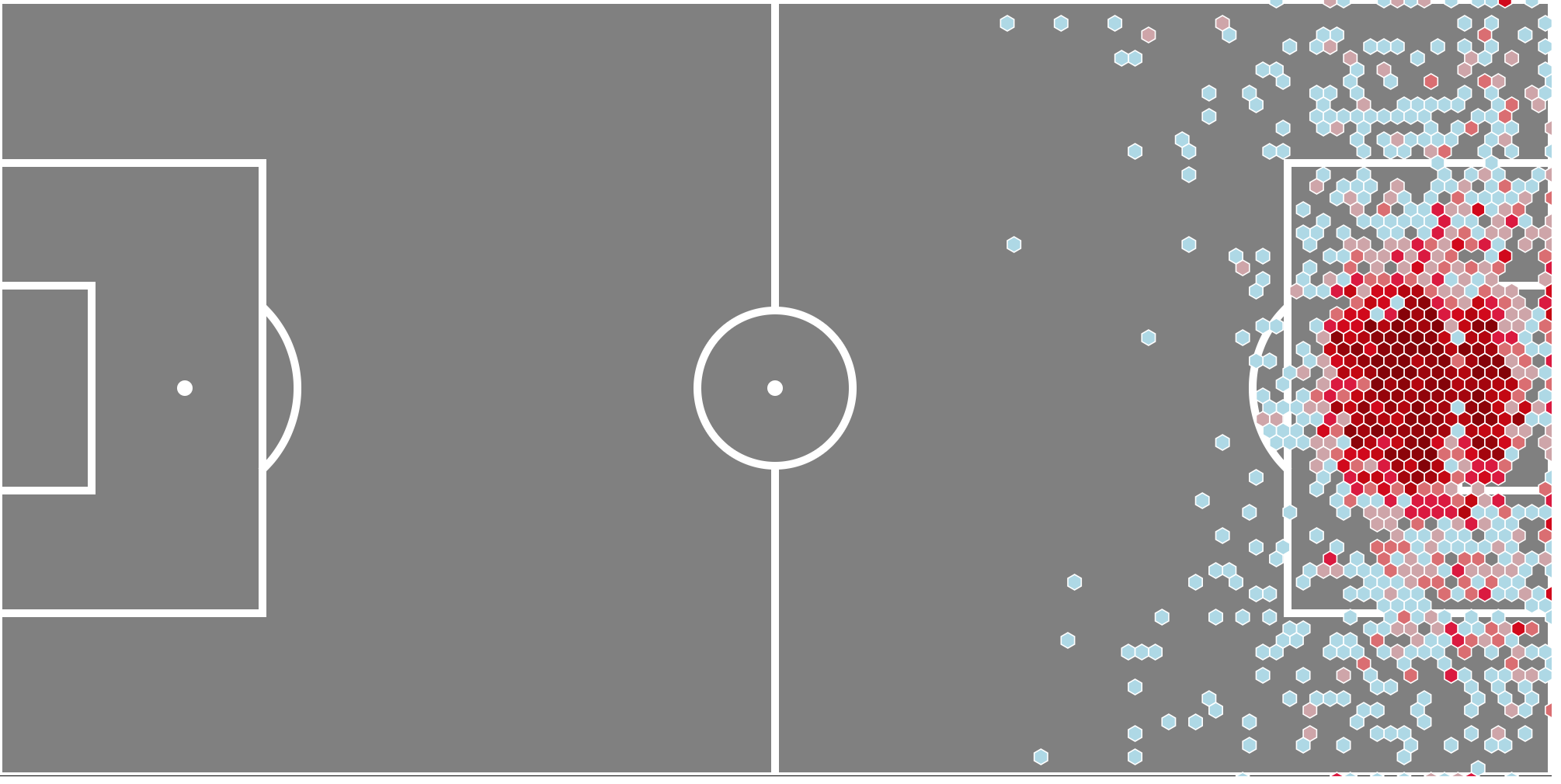
Crosses Heat Map. (Credits: Samirak93)
But these images usually depict the entire dataset of crosses that are analysed. If filtered down further, they are usually filtered down with respect to a particular player/team.
I wanted to narrow this same image to the point where these images are rendered based on user interactivity. So if the user clicks on a particular location on the pitch, the crosses nearest to it are collected and their corresponding end locations are shown. This is much more useful when user wants to visualise crosses only from certain locations rather than getting a complete view.
So the concept of cKDTree comes into picture here. It’s relatively simple to use.
The input here is the cross start location X and Y coordinates. One of the parameters we can manually provide is the search radius of the KDTree. In this case, the search radius given is 6 units.So the system find the nearest crosses around 6 units.
“point_tree.query_ball_point” is the function to find the cross_end X and Y coordinates.
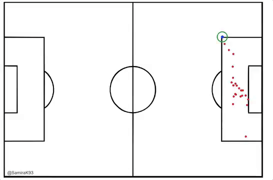
Blue Circle is Click location and outer green circle is search radius limit(Credits: Samirak93)
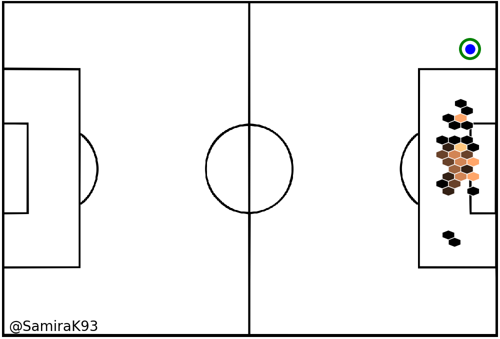
Generating Heat Maps(Credits: Samirak93)
For coaches/analyst, this could be used to analyze the crossing patterns of teams from certain location and train teams to attack/defend from similar locations.
The entire code is made available here: GitHub
I tried to build this as a working demo (using python and d3js) but couldn’t come up with anything solid. If you can bring this as a demo online, I’d be delighted to get a look at it.
If you’ve any comments/issues on the post/code, please do let me know. I’m a beginner in python and please do expect potential flaws in the code :)
Note:The data used here belongs to Opta and hence are not made available in the above code link.
Update 31-Mar-18
I’ve managed to built this tool in a bokeh plot and hosted it on heroku.
The tool can be seen here.
In case you’d like to read the steps for hosting bokeh server plots on Heroku, you can find my blog post here.
Leave your comments below or contact me on twitter: @SamiraK93